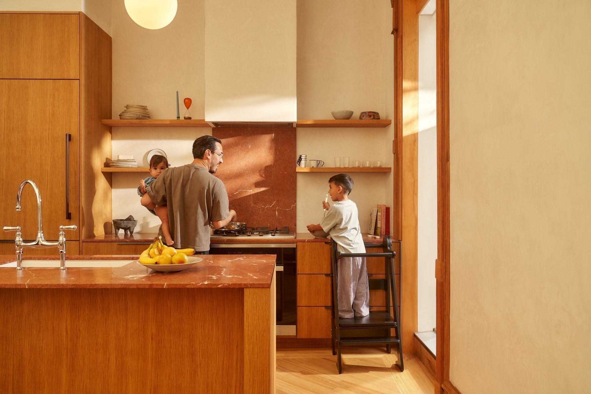
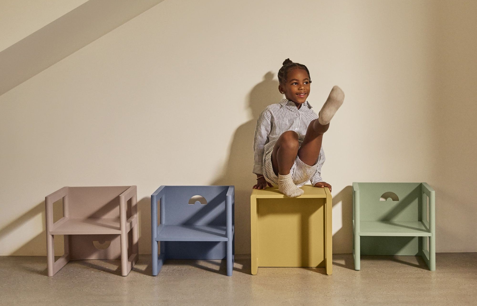
Founded in 2020 in Los Angeles, Piccalio first gained recognition for crafting beautiful wooden toys that combined high safety standards with elegant design. Over the past five years, we have expanded our core collection to include multifunctional furniture pieces for children — products designed not only to support development and play, but also to blend seamlessly into the family home.
The brand’s transformation has led us to an inflection point, sparking the desire to evolve our visual landscape to reflect our growth and deepening sense of purpose. “In a sea of plastic kids’ products, our mission is clear: bring design and beauty back into the everyday,” said Aneta Kostic, Co-founder and Creative Director. “Children’s things don’t have to feel like clutter. They should be objects you’re proud to live with — backdrops to everyday memories, both big and small.”
Before embarking on a new visual identity, we redefined our vision, mission, core values, and brand voice with the guidance of brand-building expert Ashley Domers. Our refreshed creative direction mirrors our growth and evolution, and marks a clear identity as we step into the future.

At the heart of Piccalio’s brand refresh is a new logo and wordmark that balances timelessness with play. “With the update, we wanted to connect to our brand guideposts of elegance and simplicity. The challenge was to keep some of the playful spirit of the original wordmark while also achieving a more polished look,” explained Cait Goodman, Art Director and designer.
An iteration on a geometric sans-serif font, the new wordmark shares similarities with the original. The letterforms are minimal and modern, grounded on a stable baseline—an important update that achieves a more polished, grown-up feel.
Based on a font with Bauhaus influences, it is sharp, clean, and elegant, while maintaining the approachability and slightly playful quality of our original mark.

The refreshed color palette is rooted in browns and neutrals in continuity with our original color landscape. Inspired by nature and the primary colors of light, the new palette steps outside the pastels often found in the kids’ furniture space.
“The intention was to evolve our brand by refreshing the existing palette, evolving our colors to serve as a tool for brand recognition while also reflecting our connection to nature and design,” Tayler Worrell, Sr. Director of Marketing, said.
Deeper, richer browns ground the palette in elegance and also enhance accessibility. Pops of bright tomato red inject energy and playfulness, while earthy yellow greens, sky blues, and soft neutrals fill out and soften the edges of our color scheme.

“Our previous fonts were all very fun and casual,” Goodman said. “The refreshed type choices strike the right balance between playfulness and elegance.”
For our headlines, we selected a graceful, but sturdy serif font with hints of playfulness, customized for Piccalio by Margot Lévêque Studio. To complement, the body font is a modern neo-grotesque with organic idiosyncrasies and a contemporary edge.

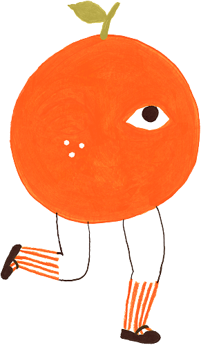
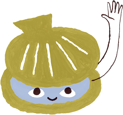
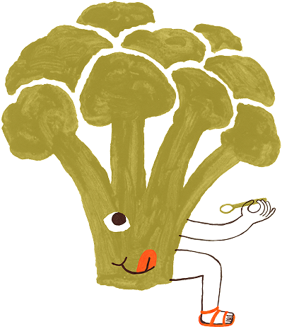
New illustrations created by Julien Roux feature anthropomorphized characters inspired by nature. Loosely based on our product categories, the hand-drawn illustrations offer a whimsical contrast to the elegance of our font and color selections.
The imperfect style and fanciful designs are reminiscent of children’s drawings, ensuring our brand speaks to the joy and imagination children radiate. Versatile, the illustrations live throughout our brand environment as single color knock-outs for print materials, full color artwork for our website, and playful details for social media and email graphics.
A Refresh that Defines Our Next Chapter
As we continue to design and craft kids’ furniture that’s as beautiful as the rest of your home, we are confident that our visual identity aligns with this mission. With this refresh, we’ve strengthened our identity—firmly rooted in our values, yet poised for future evolution. Welcome to the new Piccalio: Kid Forward. Design Forward. Parent Forward.


Leave a comment
This site is protected by hCaptcha and the hCaptcha Privacy Policy and Terms of Service apply.