Should You Go Beige or Embrace Color? What Science and Montessori Say
Last Christmas, a TikTok by @nattiejopo spray painting a colorful Christmas tree toy in more neutral tones went viral. The video created controversy in the comments, adding more fuel to the fire about the already trending "sad beige moms" topic.
While some parents agree that kids' toys and spaces can be overstimulating, others argue that children need color. What does the science say? Discover the story and research behind this trending topic.
What Is a Beige Mom?
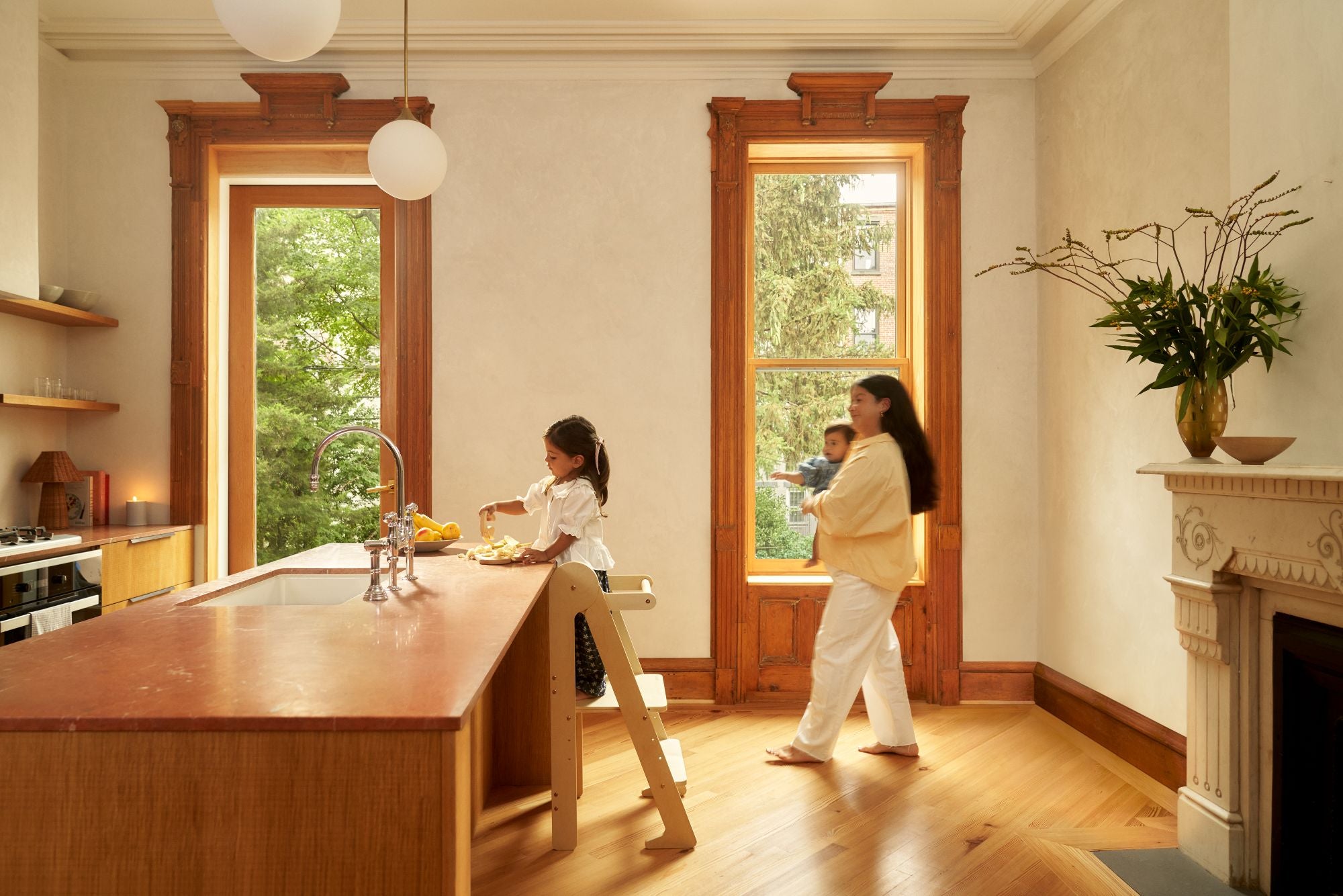
"Beige moms" are a social media trend of mothers who prefer neutral or muted colors in their homes. They post about their neutral aesthetic and may also dress their children in neutral colors. Many creators self-identify as "beige moms" by using the hashtag. Others simply share their style and aesthetic featuring neutral color palettes.
The most controversial beige moms paint their children's colorful toys with more neutral tones. Other beige moms express their frustration with the excess of loud, bright children's toys that bring on feelings of anxiety. Although beige parents may ask not to receive bright plastic toys as gifts, their wishes are not always respected.
The Origin of "Sad Beige Moms"
The origin of "sad beige moms" is a bit elusive. At some point, social media creators began making jokes about beige moms. Many people call them out for seeming "lifeless" or "soulless" because they avoid bright colors in their homes.
One such creator, Hayley Deroche called "sad beige" on her TikTok, went viral for making videos poking fun at the beige mom aesthetic. She creates satirical videos about "sad beige toys for sad beige children." In her videos, Deroche shares about new collections of toys and clothes from an imaginary company named after the German filmmaker, Werner Herzog.
In one viral TikTok with 1.8 million views, Deroche shared images from a website of children's toys. Noting the children's sad faces and drab colors, she dubbed it, "The seasonal depression collection."
Other creators also began referencing the sad beige trend and discussing sad beige parenting. Many commentators delight in joking about the trend of the beige aesthetic. They emphasize that children need color and that beige parents take their neutral color schemes too seriously. Beige lovers, on the other hand, argue that they love the calmness neutral tones offer.
An Overview of the Rise of the Beige Aesthetic
Beige in general has become more popular since the minimalist movement in the 1990s. Neutral colors like beige, grays, and browns, are also trending in clothing. These colors aren't just popular, they also represent aspirational goals.
In 2020, Esquire reported that beige colors are a sign of wealth and status. Often identified with names such as "ivory," "camel," or "sand," beige colors symbolize luxury. Similarly in interior design, Homes and Gardens says that beige is synonymous with quiet luxury. These trends also align with people choosing organic linen and cotton for their clothing and upholstery.
Another important splash point in the rise of beige is the style of celebrities. Kim Kardashian's aesthetic in the last few years also made beige more popular.
Her bedroom features a mix of cream and beige colors with no bright tones or art. A variety of textures from the rug, bedding, and wooden tables add interest. Yet, the overall design is cohesive and chic. Kardashian has said she chose this aesthetic to help her feel calm in her home.
On social media, people aspire to copy this minimalistic design. Today, the beige aesthetic is widespread. While some might not go quite as minimalistic as Kardashian, many do stick to neutral tones, seeking out furniture and clothing made of natural wood or undyed cotton or linen.
The Science of Design in Children's Spaces
What happens to children when beige parents use their style preferences in playrooms and nurseries? Many anti-beige parents and educators argue that color is important for children's development. However, what does the science say?
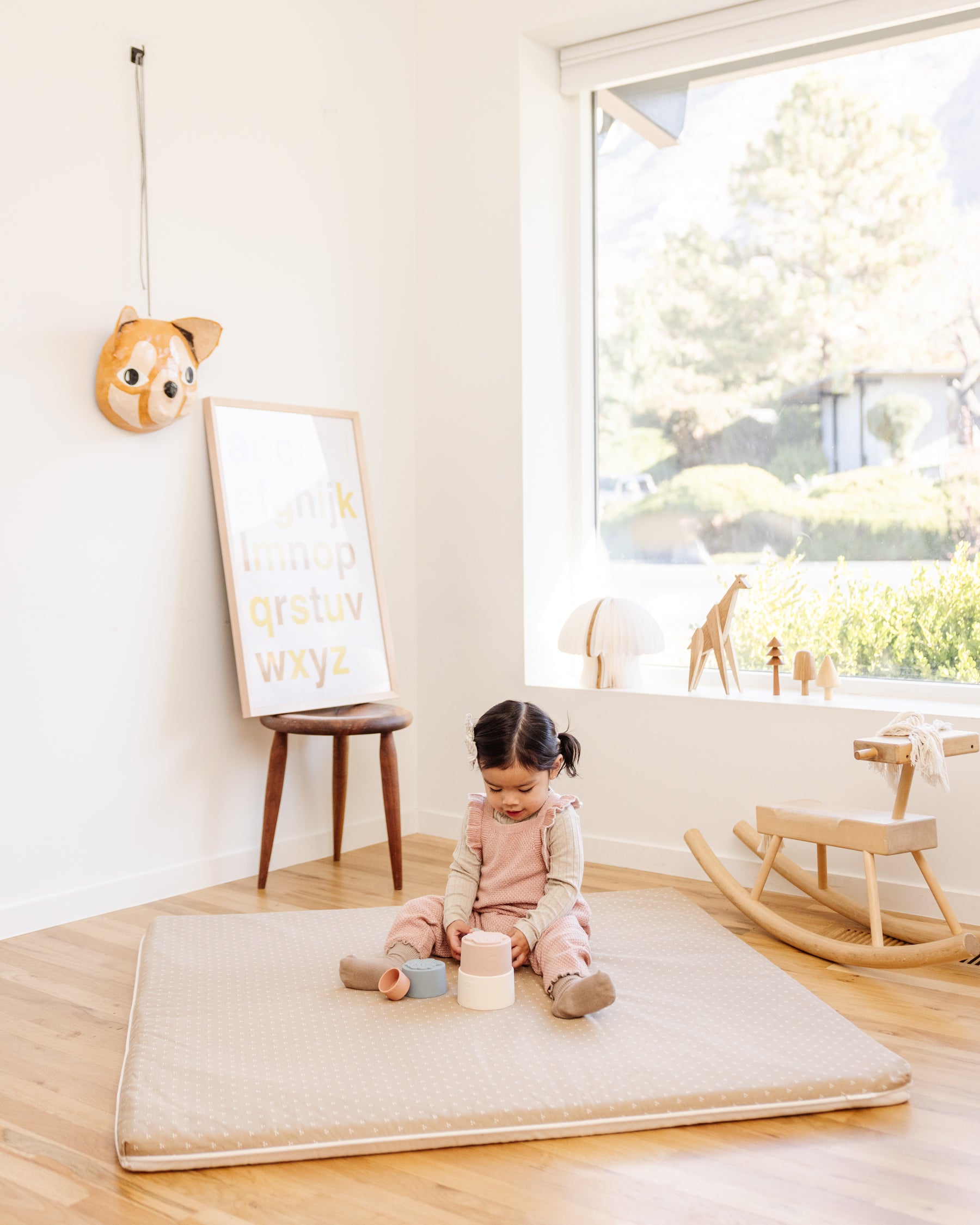
Many studies show that too much color and excessive patterns can disrupt children's concentration. One study showed that kindergarteners learned new content better in sparsely decorated classrooms than in heavily decorated classrooms. Similarly, preschoolers were more distracted when playing on colorful surfaces than on more neutral surfaces.

Children's play spaces are also often overwhelming with color and patterns. Have you ever stepped into a children's play space and felt the onslaught of sensory stimulation? Even learning spaces like kindergarten and elementary classrooms often feature many contrasting colors on bulletin boards, displays, and decorations.
Yet, the studies mentioned show that children may feel overwhelmed in spaces with too much decor. So, should we remove color from children's spaces? These studies don't show the whole picture.
Babies are attracted to contrasts in color. Although babies can see color from birth, they can see bright and contrasting colors best. This is why many baby books and toys feature black and white images or bright colors.
Similarly, research shows that colors can help young children with spatial reasoning. This suggests that color may be helpful for children in some educational settings. Ultimately, as with most things, the answer may lie in a middle ground. While neutrals have their place in creating a calm environment that promotes concentration, color also plays its role.
A Montessori Perspective on Interior Design for Kids
As a former Montessori teacher, I often think back to my training about creating the ideal environment for learning. Montessori noticed that children concentrate best when neutral tones offer a calming background for learning.
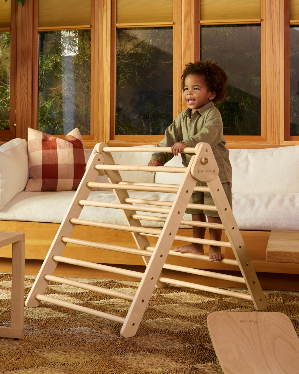
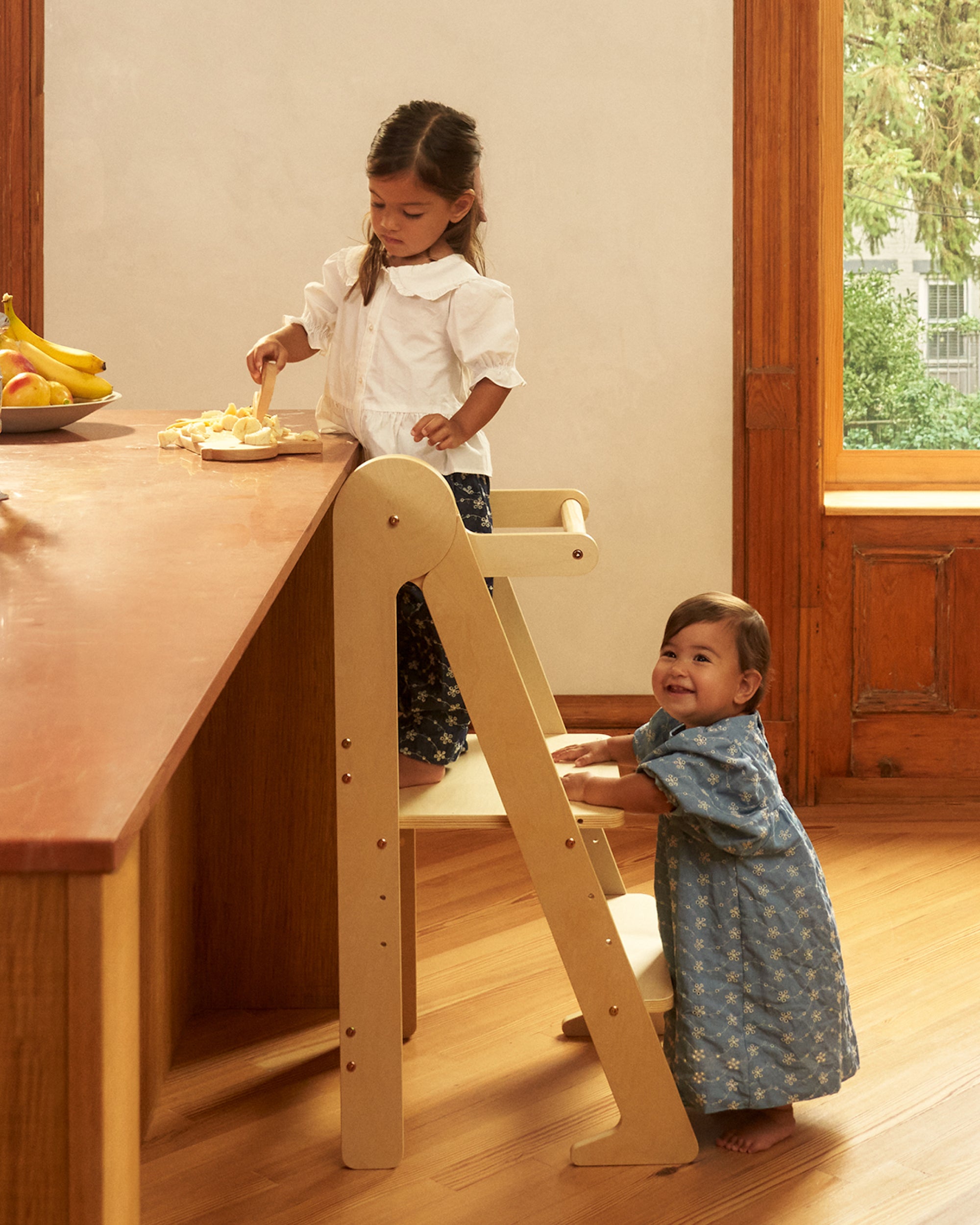
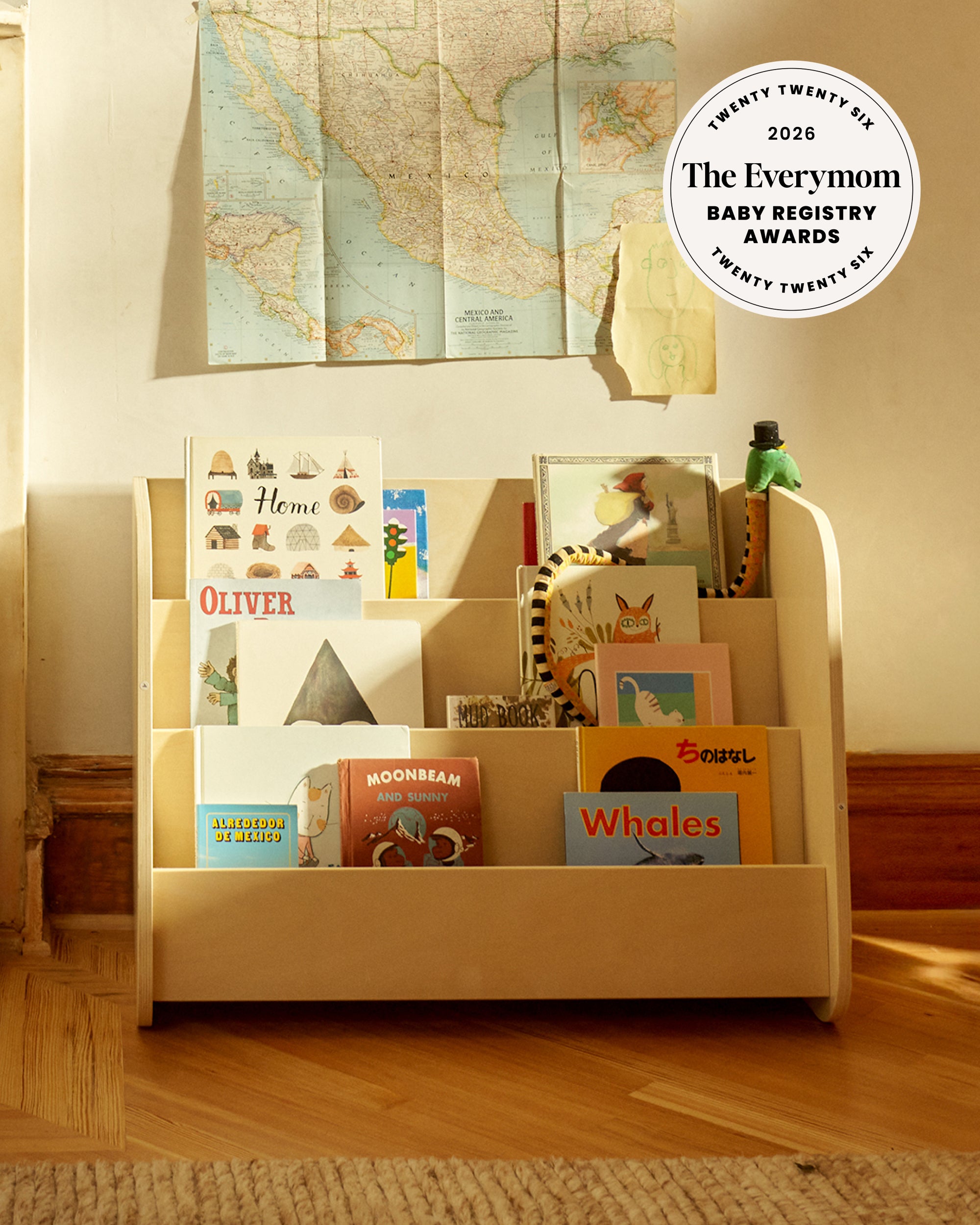
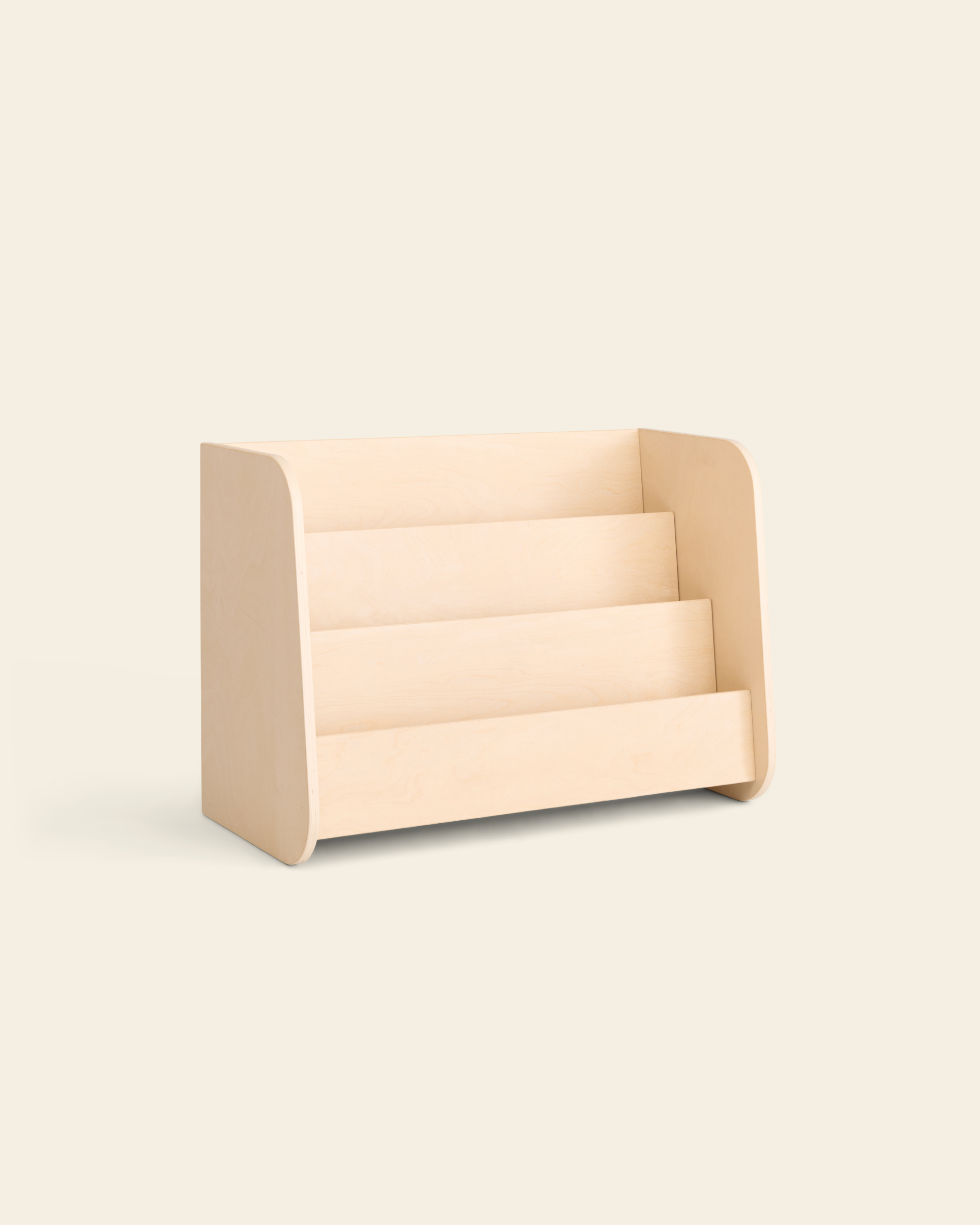
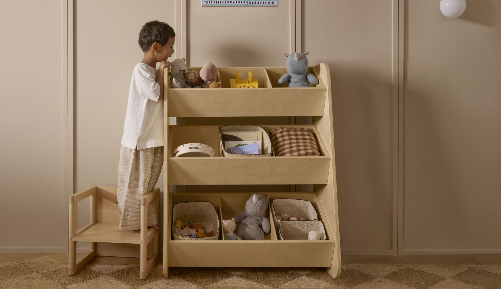
This is why Montessori classrooms often feature neutral-colored walls. Montessori furniture is typically made of beautiful natural materials such as wood. Additionally, Montessori encouraged teachers to use natural fibers throughout the classroom to teach children about textures and the natural world.
Yet, if you think Montessori classrooms are devoid of color, you're wrong. Montessori materials feature bright colors to teach important concepts.
For example, the Montessori shape puzzle for toddlers includes a bright yellow triangle, blue circle, and red square. The color differences highlight the different shapes.
Similarly, Montessori used colors to represent the hierarchies of numbers in the decimal system. Units are green, tens are blue, and hundreds are red. You'll also find colorful beads, fabrics, and blocks elsewhere in Montessori classrooms.

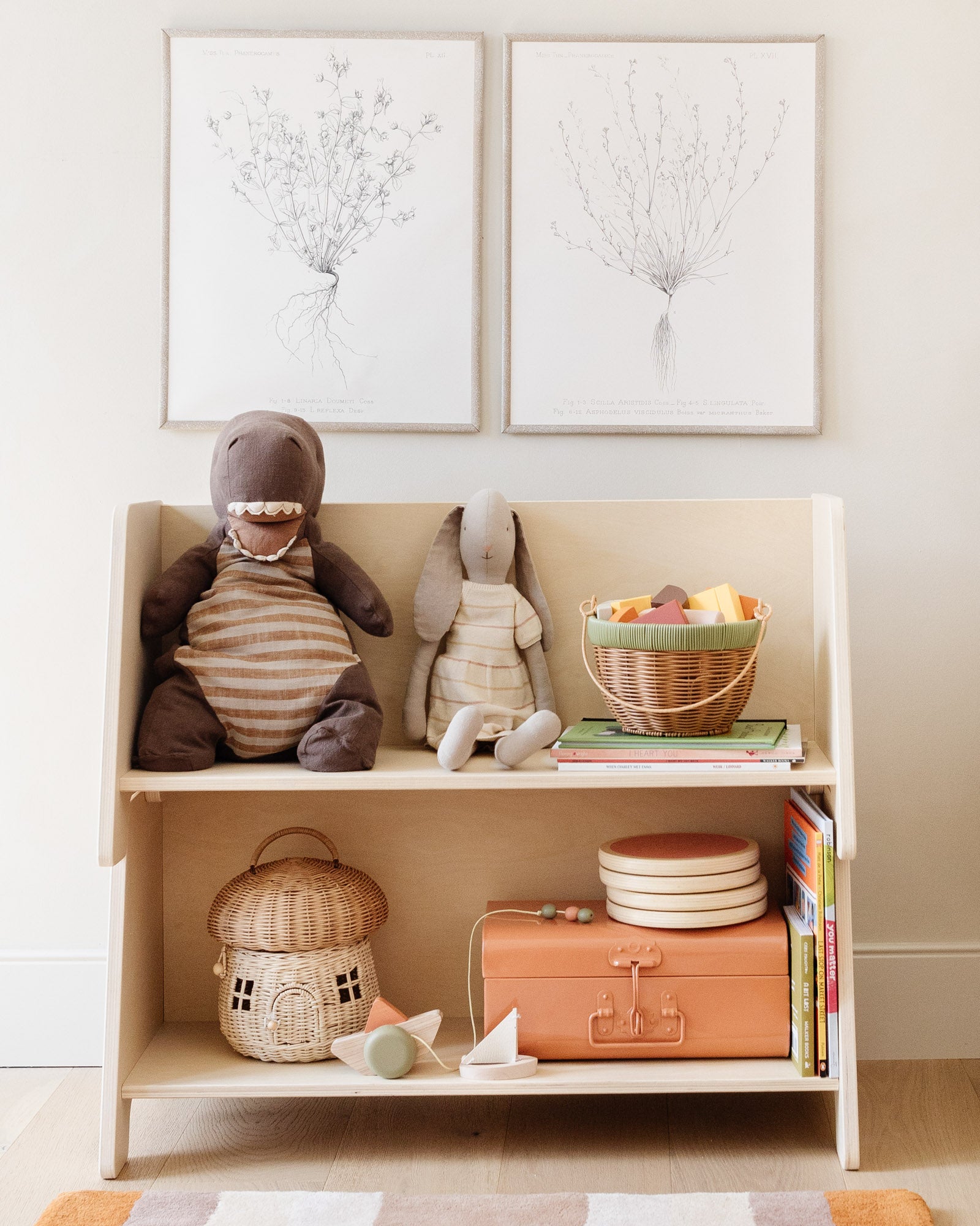
Montessori believed that keeping shelves neutral helped make the colorful materials and toys more exciting and interesting for children. A classroom with too much background color and noise would distract from the materials, she believed.
Montessori also encouraged teachers to add a few attractive, intentional decor pieces throughout the classroom. Perhaps a lovely lamp made of metal adorns a shelf or an impressionistic painting hangs on the wall. Or, maybe a colored rug helps create a welcoming reading area. She intended these uses of color and art to help create a space that feels homey and beautiful for children.
The Case for Beige in Children's Spaces
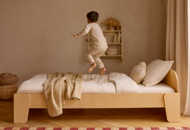
Ultimately, it's up to each parent to design a space where both they and their children feel comfortable. Beige and neutral tones offer a calming backdrop for play and learning to unfold. Too much color and bright, gaudy patterns can make it hard to concentrate.
On the other hand, no color may feel empty and lifeless. Learning can and does happen through color. Yet, your child's playroom doesn't have to look like a crayon box exploded to enjoy the benefits.
Where do you stand in the beige moms debate? Tell us how you design your child's space and your preferences in the comments below.
Sources
1. Adobe
2. Esquire





1 comment
This was an insightful read! My personal preference and what works for my family, is a mix of both. I find solely neutral or “beige” spaces to be too one dimensional and the lack of contrast to be unsettling. On the other hand, plastic, all bright toys with lots of branding and light up features, and overly decorated spaces can feel overwhelming. My husband and I try to stick to toys and furniture that offer neutral and more natural materials, while having art on the walls with color and colorful blankets. We are also big fans of Lovevery and their toys are a great blend of colorful wood and natural.
Lindsey Parry
Leave a comment